DURATION
2017-2019
CLIENT
Grab
Singapore
ROLE
UI/UX
Visual Designer
SUMMARY
I joined Grab in late 2017 as one of the youngest designers. I initially worked with the Growth team, contributing to experimental projects and home screen redesign concepts. Later, I transitioned to the Food team, where I assisted with prototyping, illustrations, animations, and the launch of GrabFood in Singapore.
Reimagining the home screen that drives south east asia
One of my first responsibilities after joining Grab's Growth team was to help reimagine the starting screen experience. As Grab expanded its range of services, it became essential to guide users seamlessly to these new offerings while preserving the familiar user experience.
I had the privilege of being part of the design team that contributed to the ideation process, which ultimately shaped the current screen in use today.

research
and
analysis
To gain a deeper understanding of the existing design's strengths, weaknesses, and potential opportunities, I conducted a SWOT analysis. This helped me identify key insights that guided my design decisions.

existing
design
I conducted a thorough examination of the existing design, questioning each element: Why is it here? Is it necessary? What purpose does it serve? Can it be improved? These critical questions helped anchor and inform my design approach.

Competitive
analysis on
super-apps
As Grab aims to become Southeast Asia's leading super app, I studied competitors like Uber and Meituan to gain a deeper understanding of design trends and common user behaviors in similar platforms. I analyzed each aspect carefully, seeking opportunities to learn from and enhance their design approaches.

converge,
ideate,
wireframing
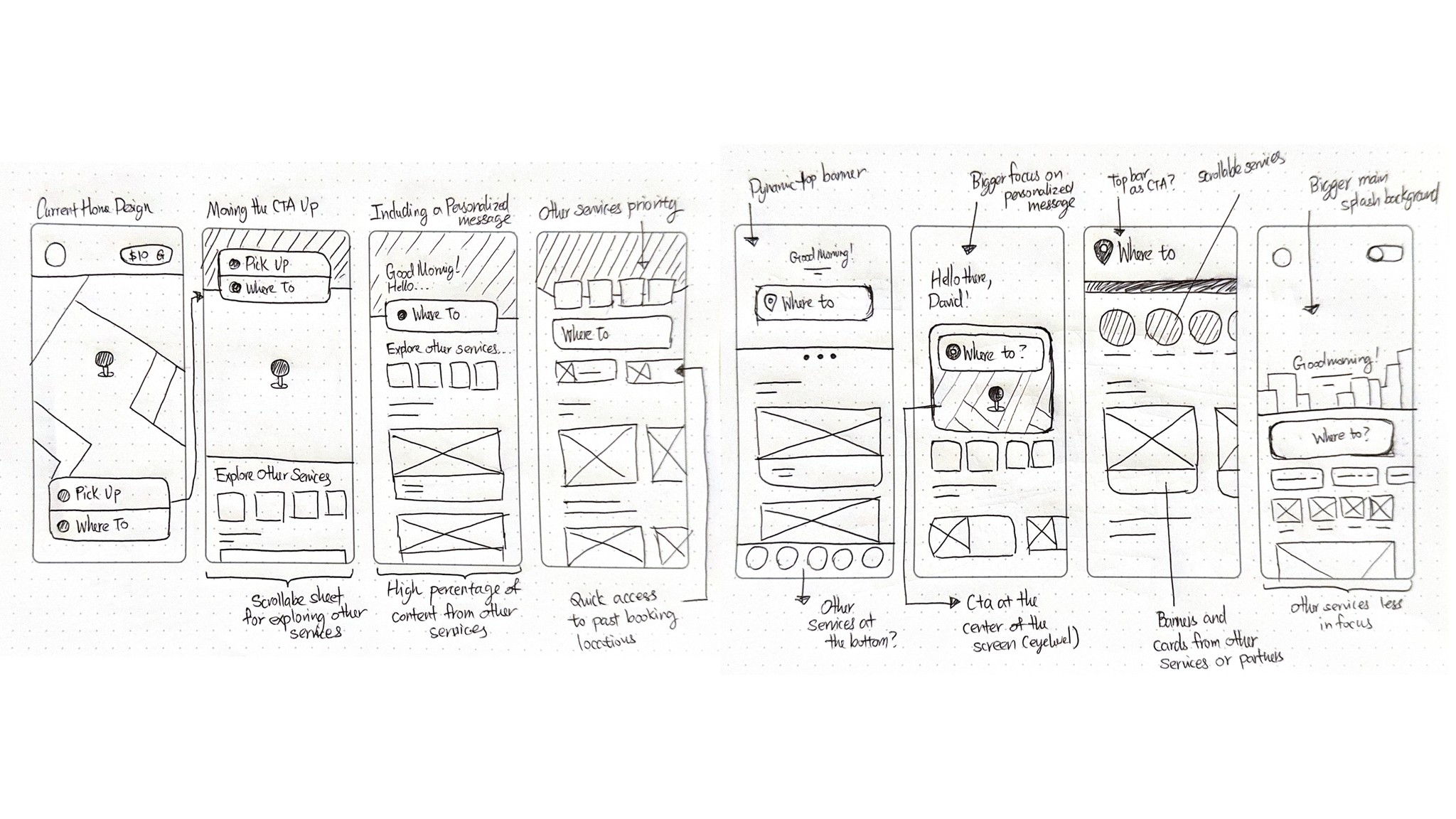
After synthesizing insights from the analysis, I created a paper wireframe to quickly explore potential design options. These wireframes were then evaluated to assess their feasibility and usability.

Lowfi
mockups
The quick paper sketches helped me swiftly eliminate impractical ideas and served as a reference for creating a low-fidelity digital mockups. I made a point not to limit my design, exploring options that were drastically different from the current layout.

hifi designs working
with design systems
and across teams
With Grab’s extensive design system already in place, I generated hifi mockups that are aligned with the company’s established design language. Apart from using existing icons and illustrations, I also created new components and illustrations that integrated seamlessly with the system.
proposed
design
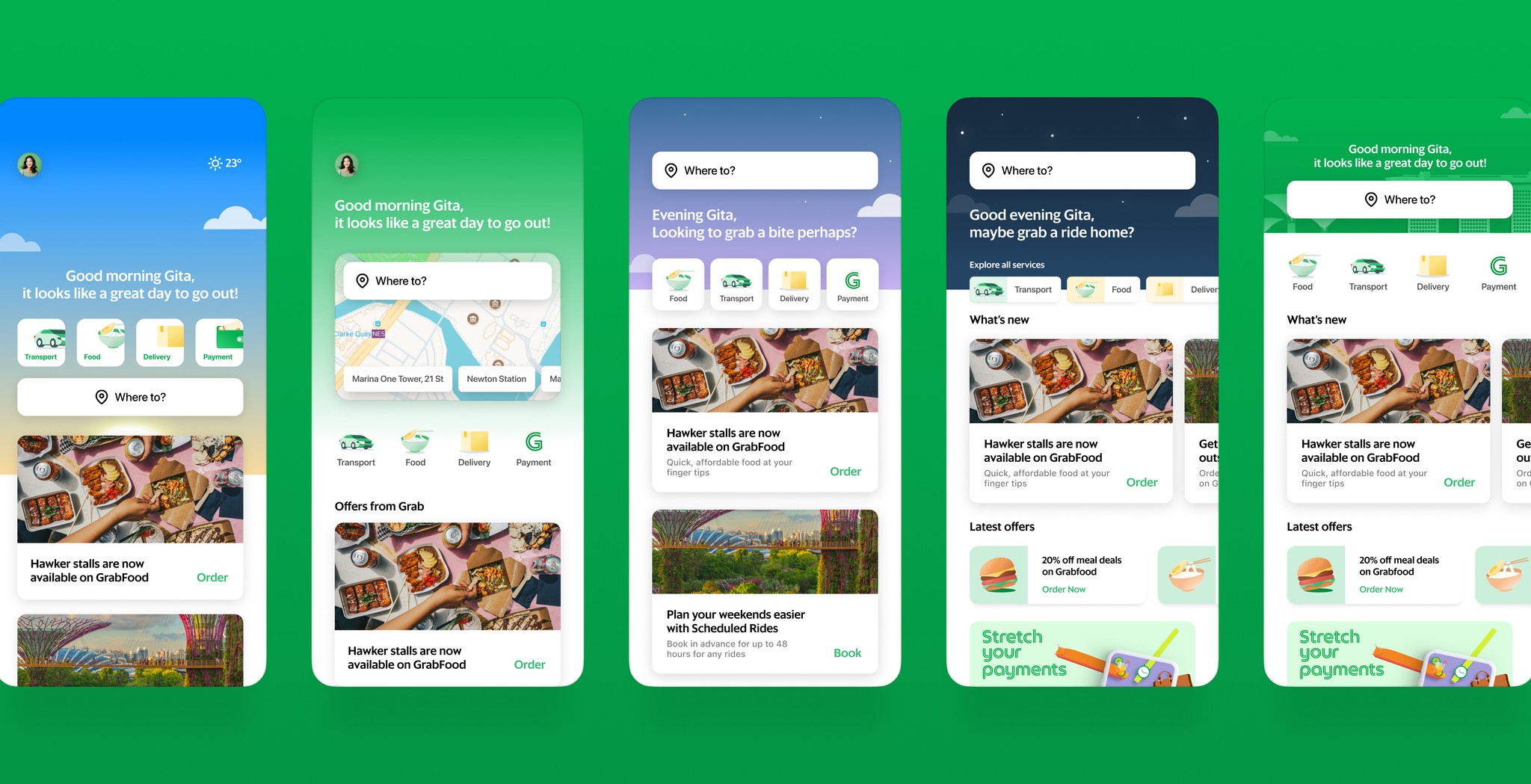
The final design enhances Grab's homepage by repositioning the destination field higher, making it more accessible and in line with natural eye movement for quicker interaction. Key services are prominently displayed just below the main call-to-action, maintaining clarity without introducing clutter. Users can easily scroll down to discover additional features.

playful projects
and hackathons
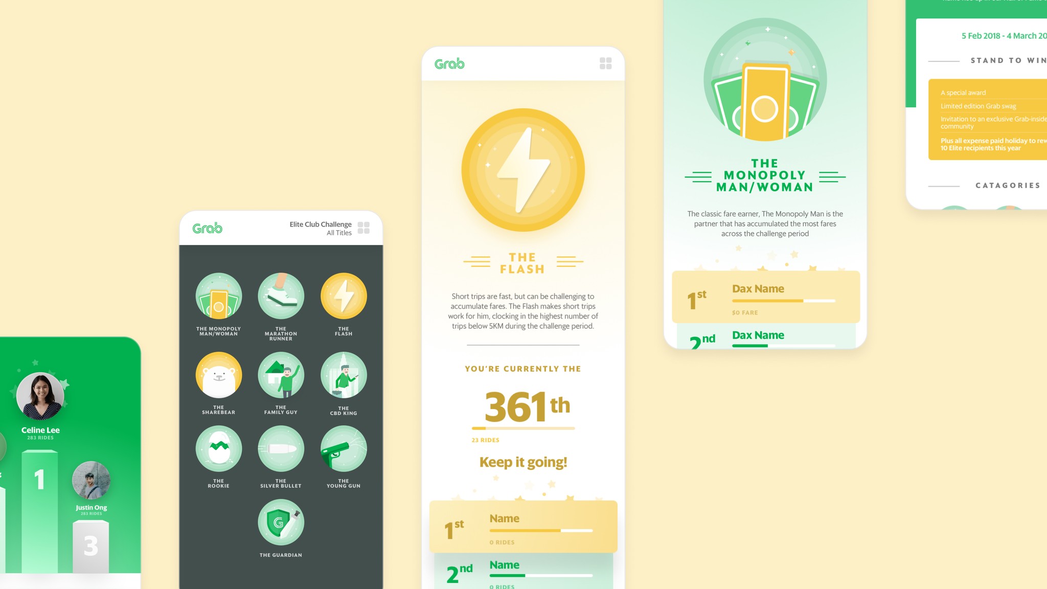
As a member of the Growth team, I actively participated in hackathons and design sprints to develop engaging side projects for the company. One notable project I led was the Driver Leaderboard, which won Grab's internal hackathon. This project was designed to be a fun and intuitive mobile web experience within the app.
I also developed prototypes and animations for experiences utilizing existing illustrations from the design system and creating new styles that aligned with it.

illustrations
and onboarding
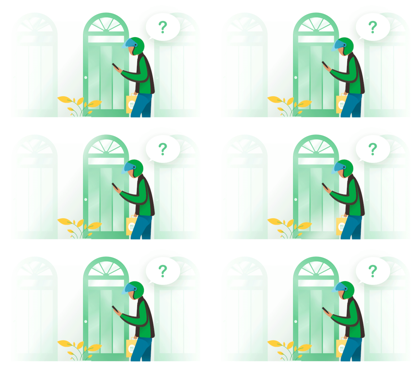
These custom illustrations I have modified complements the user experience and help guide users with ease


