DURATION
2022 -
Present
CLIENT
Loch Inc
ROLE
UI/UX
Visual Designer
SUMMARY
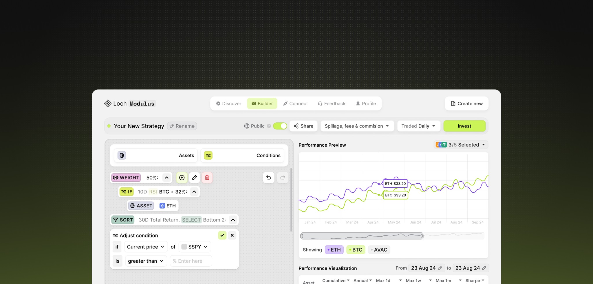
Loch is a cryptocurrency startup offering an institution-grade wallet reader, aggregator, and search engine. I joined Loch in May 2022, collaborating closely with the founder to help bring his vision to life from the ground up. The platform continues to grow, with new features like Copy Trade and the soon-to-launch Modulus, an algorithmic investment tool.
the human-centered wallet aggregator
While there are plenty of wallet readers and search engine platforms available, many provide comprehensive information but fall short in user experience. Loch aims to be more intuitive, user-friendly, and to lower the barriers typically associated with these platforms.
Problem
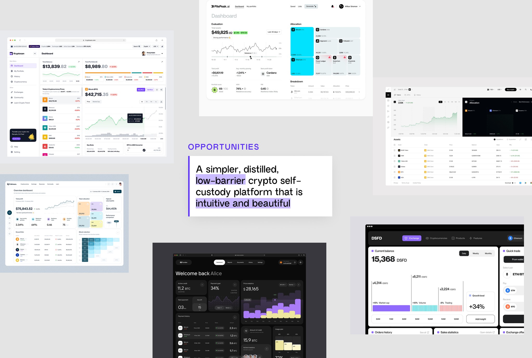
Beginning with the problem statement, a competitive analysis was conducted on platforms like Nansen.ai, Etherscan, and Solscan. This research offered valuable insights into design strategies for presenting large volumes of data. By examining how these platforms handle data display, we identified best practices and areas for improvement.
opportunities
The challenge also presented an opportunity for Loch to stand out as something entirely different—designed with the user at its core. By lowering the entry barrier, simplifying information, and delivering a clear, streamlined experience in the cluttered world of crypto, Loch aims to redefine the user experience.
WIREFRAMING
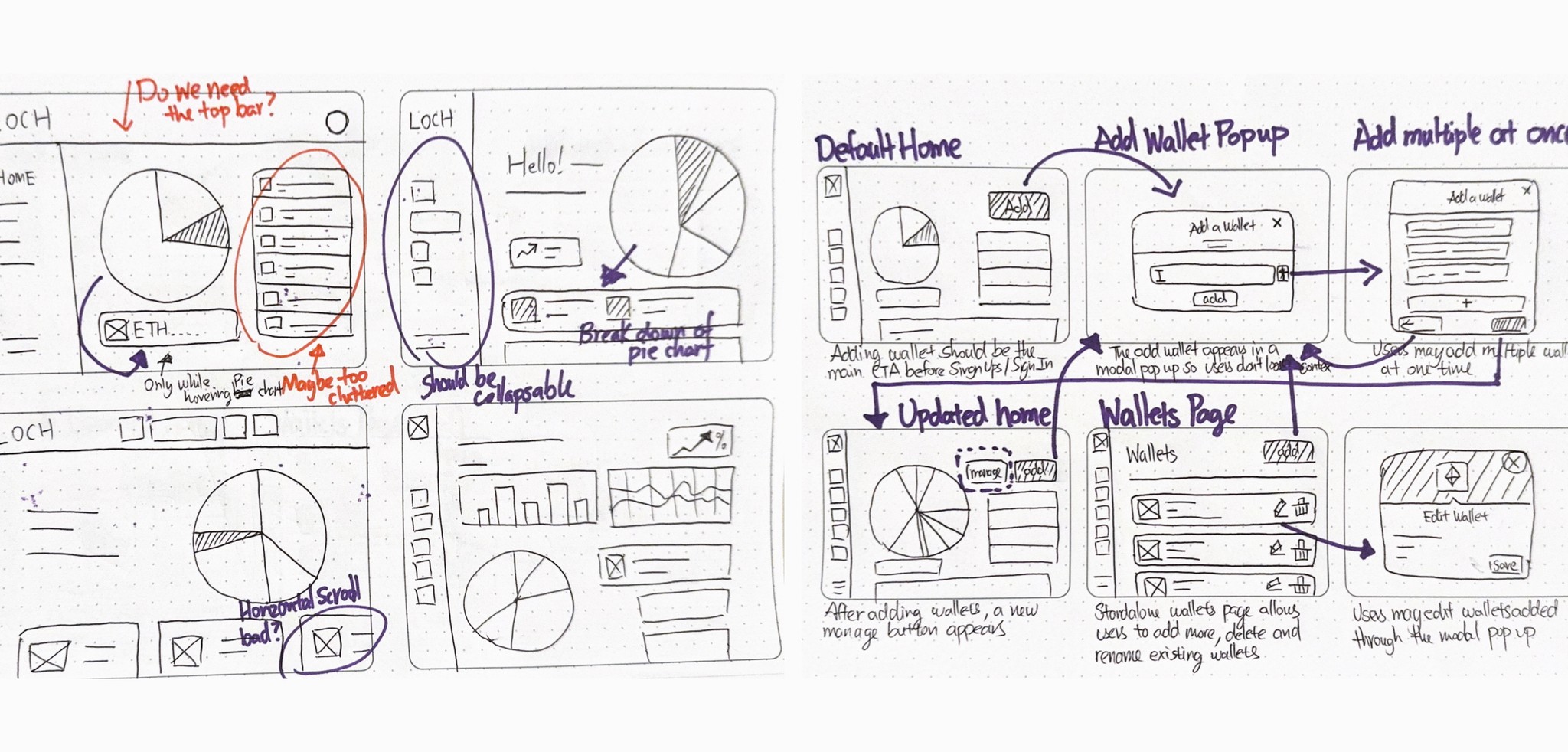
Using the founder's requirements and feedback, sketches and wireframes were created to visualize Loch's interface. The aim was to present information in a highly visual format, making it easier for users to understand and manage their assets.
low-fi
mockups
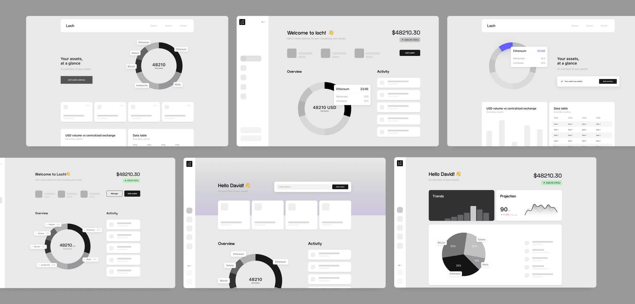
Based on feedback from the wireframes, low-fidelity mockups were created to test the feasibility of the layouts and visualize how tables, charts, and content would overlay within the interface.
PROTOTYPING
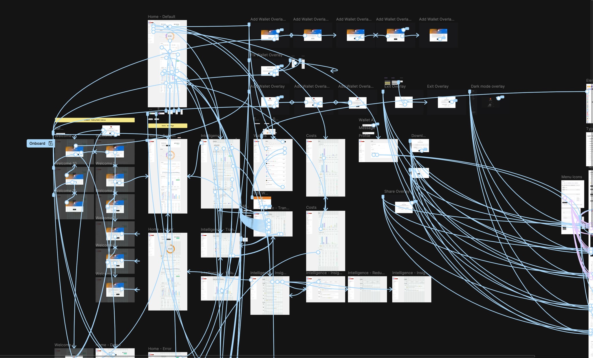
A fully functional prototype was developed in Figma, showcasing essential features such as adding multiple wallets, navigating between pages, and signing in and out. This prototype served as a comprehensive representation of the Loch design, enabling thorough testing to identify any pain points or areas for improvement.
first
iteration
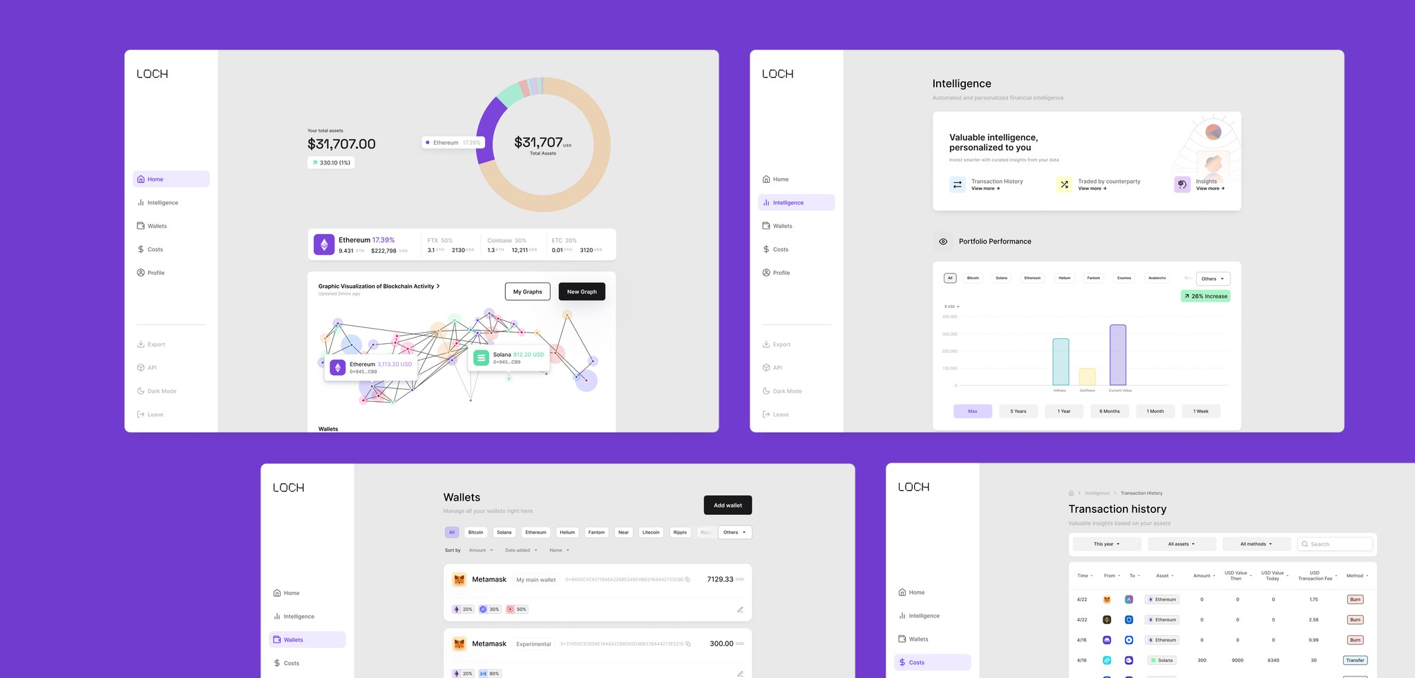
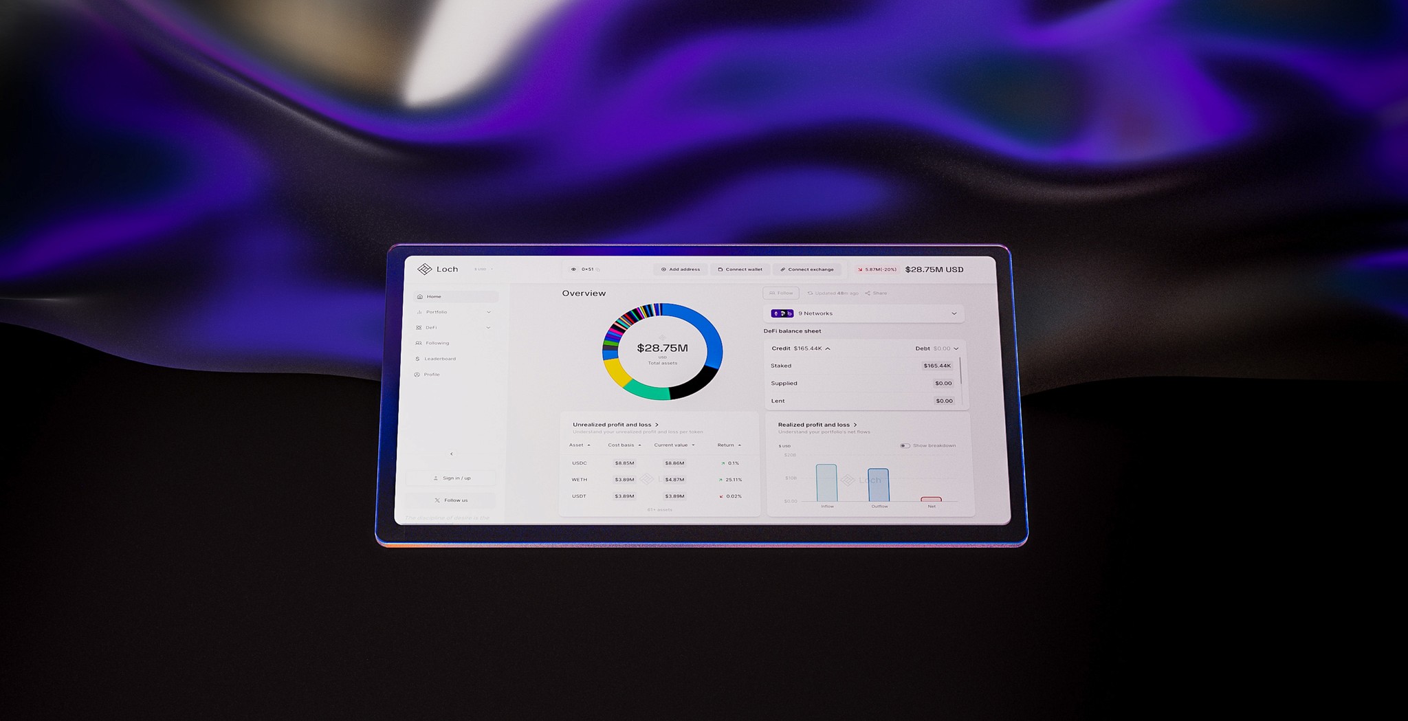
The initial design outcome for Loch is clean, straightforward, and user-friendly. The design emphasizes visual elements, such as a prominent pie chart that instantly displays users' assets at a glance, eliminating the need for in-depth exploration. Additional charts are readily accessible, and ample white space is used to minimize clutter and distractions.
A product trailer was made from scratch to introduce Loch
modulus

